Introducing Jetstar airlines
4 x
Faster than competitors
15 %
Reduction in time to book
The Challenge
Jetstar.com is one of Australia’s top five ecommerce sites, handling over 70 million visits a year and driving around 80% of the airline’s revenue. That scale meant every second of load time, every click, and every moment of confusion directly impacted revenue, brand perception, and customer satisfaction.
Jetstar’s digital experience had grown complex over time, with multiple flows, legacy patterns, and a booking journey that felt slow and fragmented. Customers expected a modern travel experience: fast search, clear prices, simple add‑ons, and a sense that they were in control from home page to boarding gate. Jetstar needed to materially speed up the experience, reduce booking friction, and create a unified design language that could stretch across web, mobile, and airport touchpoints.

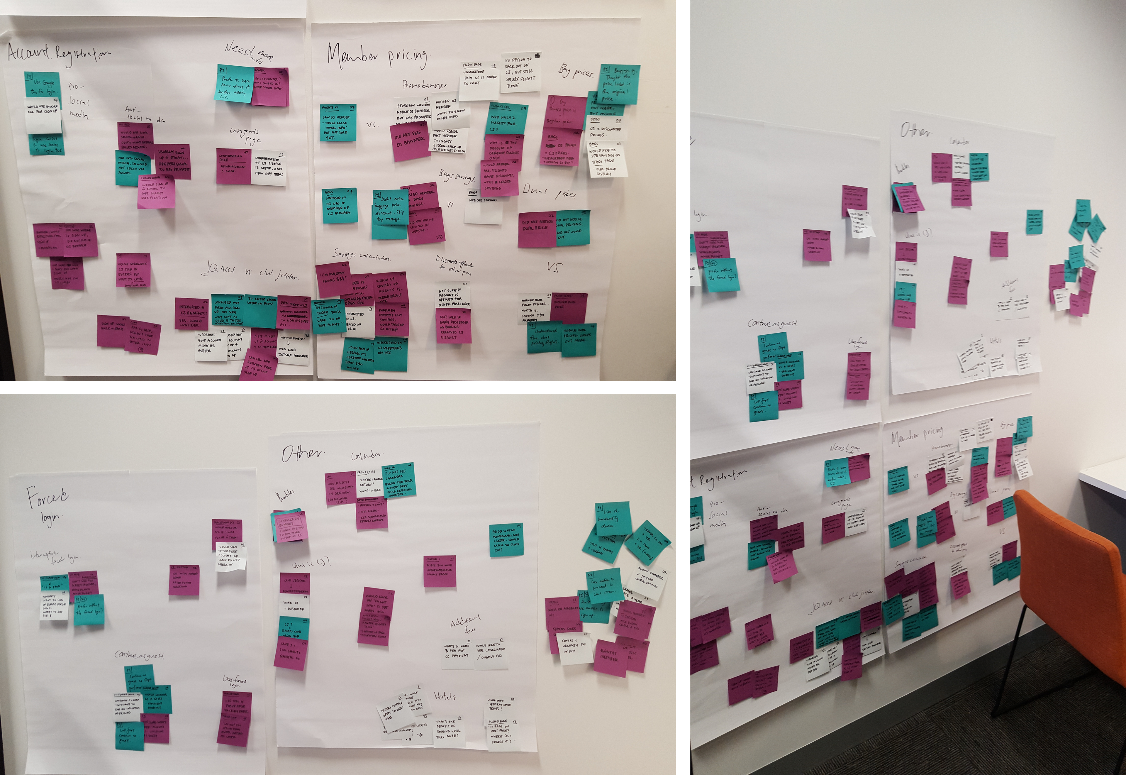
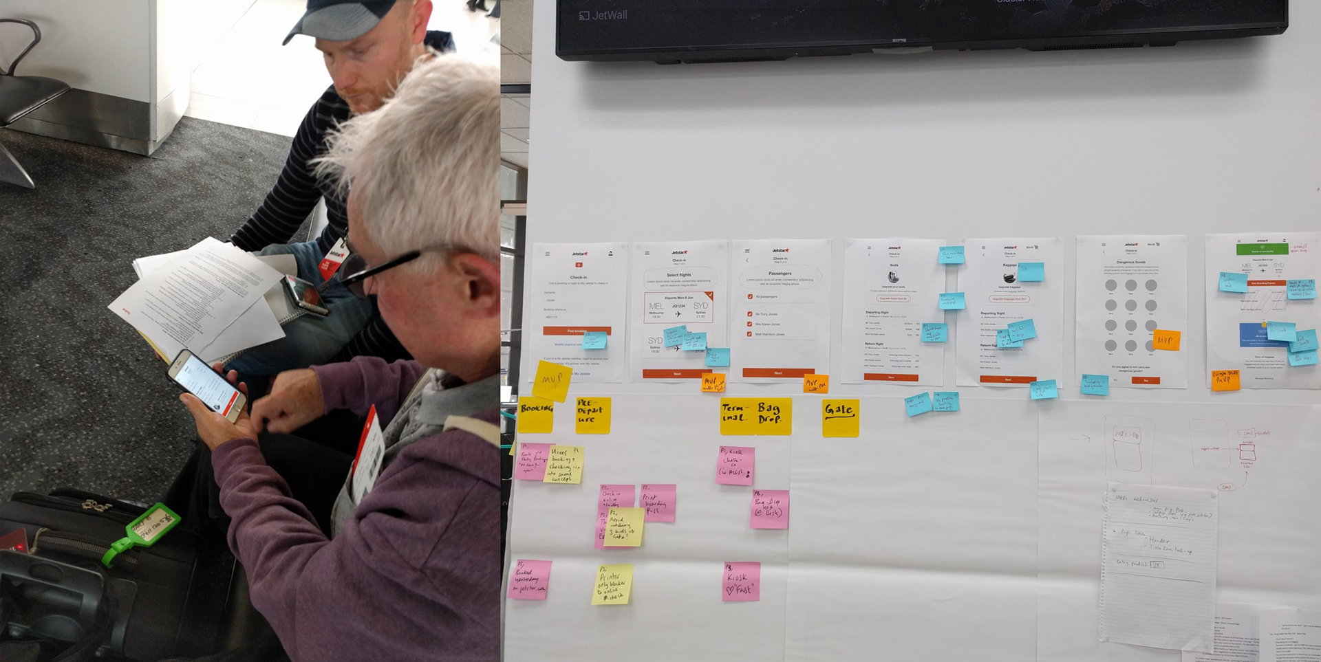
The approach
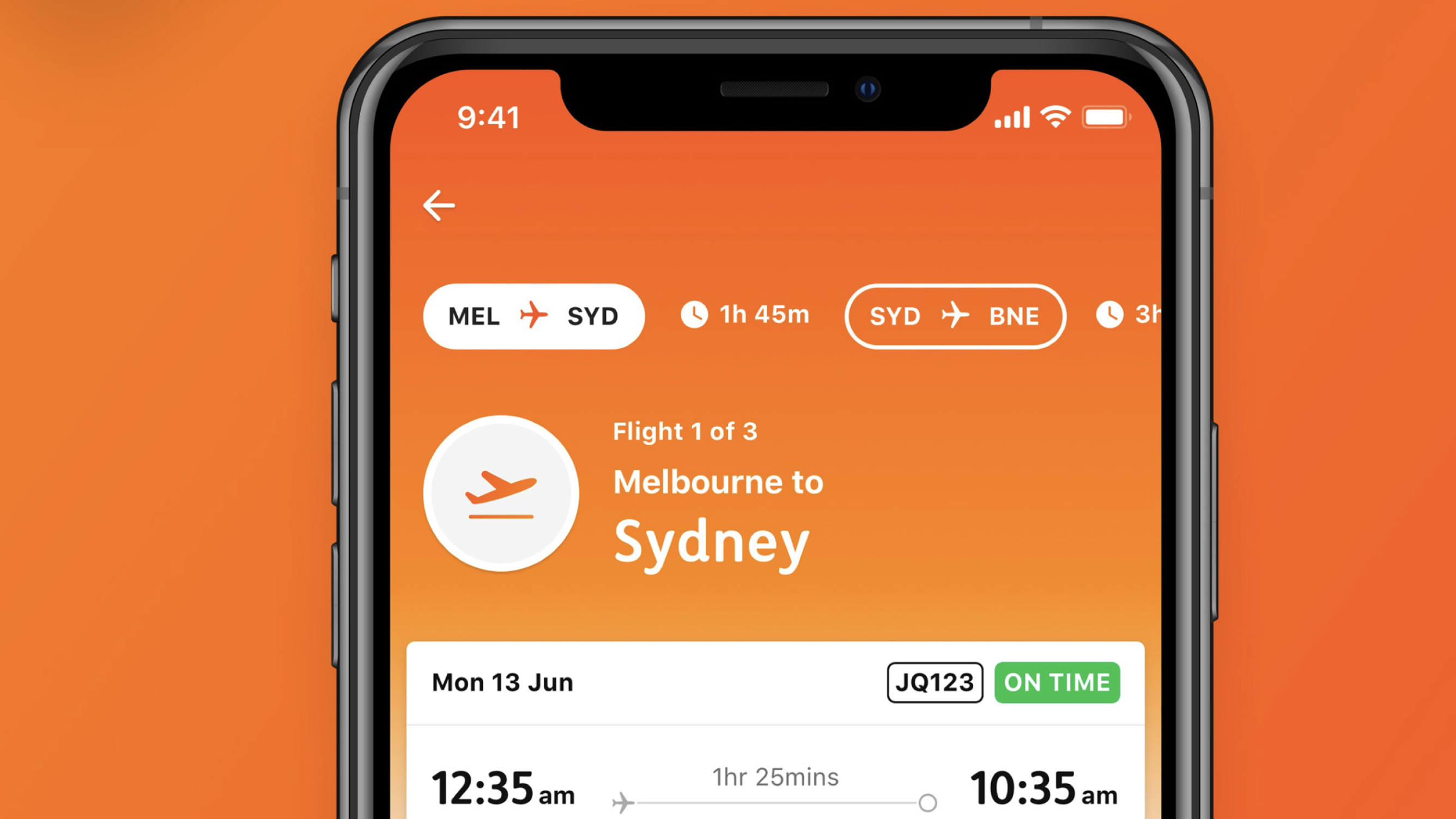
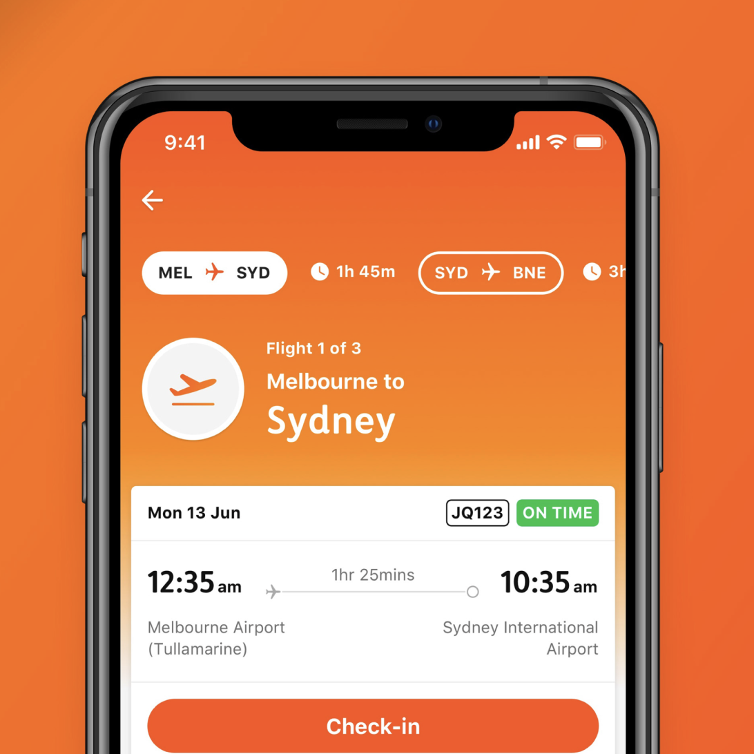
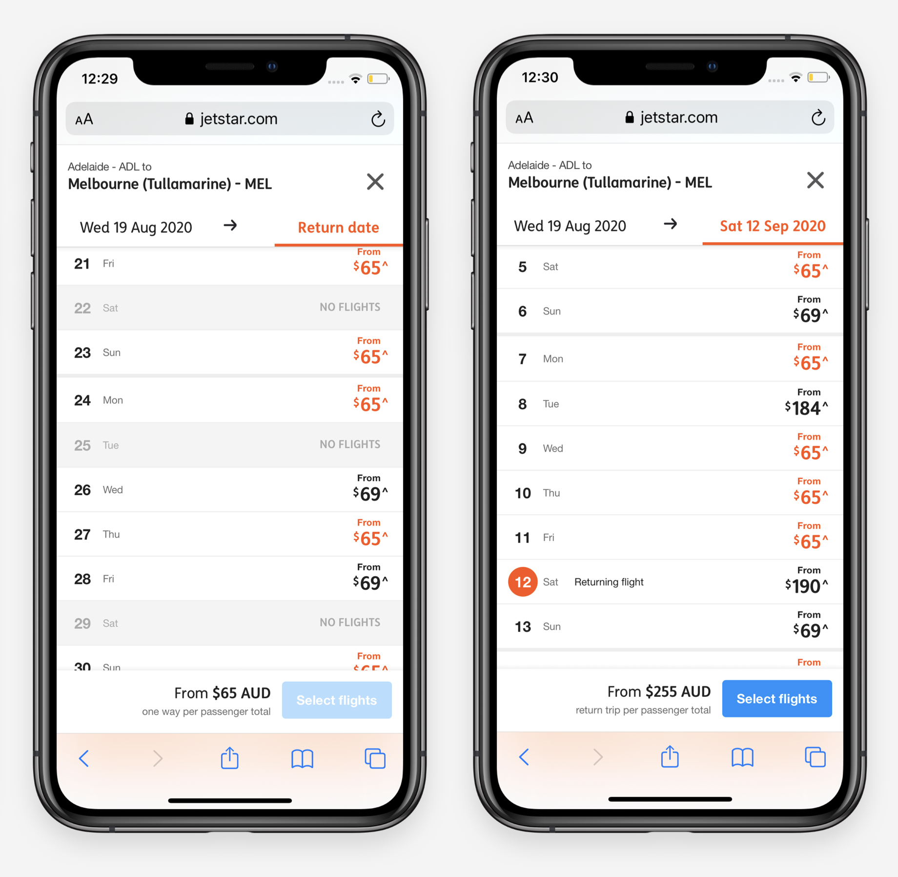
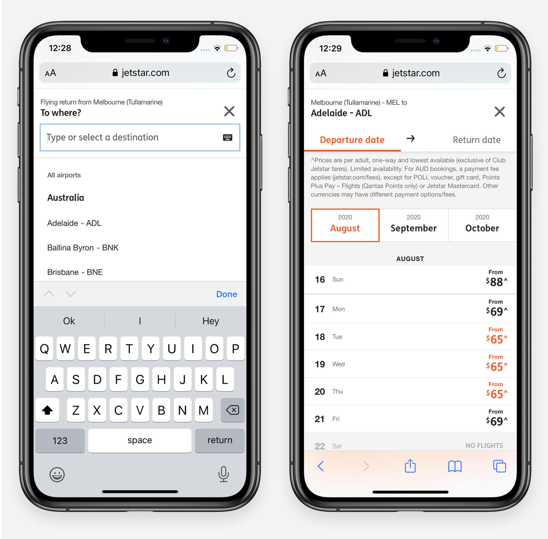
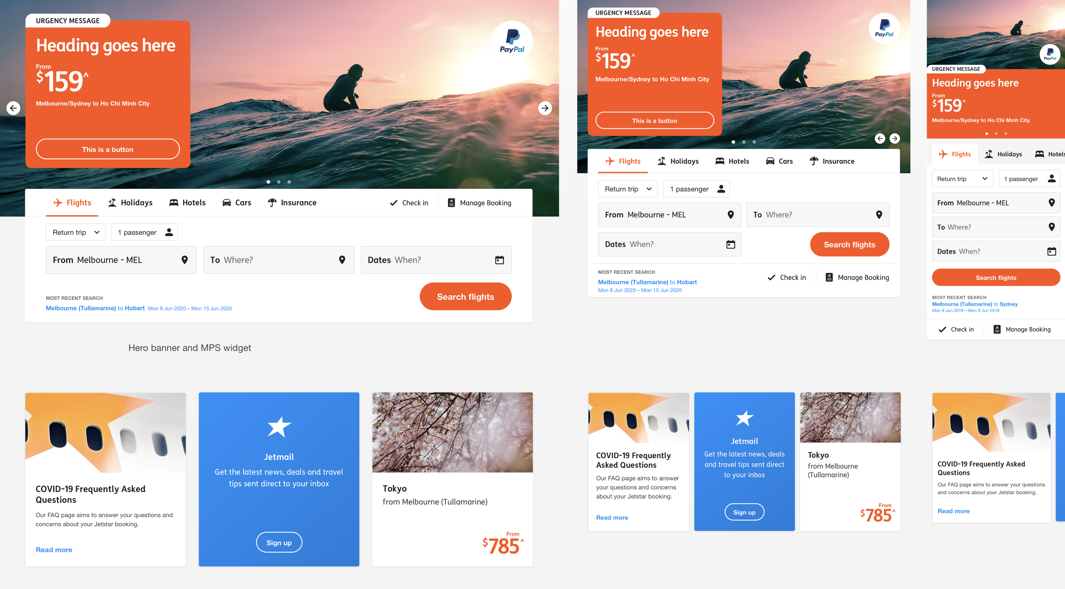
The new booking journey surfaces what matters most at each step: origin and destination, dates, and fare first; then clearly explained extras like baggage, seats, bundles, and hotels. Content, pricing, and choices are structured to make trade‑offs obvious, reduce cognitive load, and minimise surprises at checkout. Customers can choose bags, upgrade seats, or opt into bundles with clear prices and simple controls, while still having the option to skip extras if they just want to fly.
Beyond the core booking flow, the work extended to mobile boarding passes, the smartphone app, and an early chatbot prototype so the experience felt cohesive from planning to day‑of‑travel. The same design system underpins all of these, ensuring familiar patterns whether a customer is checking in on mobile or managing extras on desktop.
The solution
The new booking journey surfaces what matters most at each step: origin and destination, dates, and fare first; then clearly explained extras like baggage, seats, bundles, and hotels. Content, pricing, and choices are structured to make trade‑offs obvious, reduce cognitive load, and minimise surprises at checkout. Customers can choose bags, upgrade seats, or opt into bundles with clear prices and simple controls, while still having the option to skip extras if they just want to fly.
Beyond the core booking flow, the work extended to mobile boarding passes, the smartphone app, and an early chatbot prototype so the experience felt cohesive from planning to day‑of‑travel. The same design system underpins all of these, ensuring familiar patterns whether a customer is checking in on mobile or managing extras on desktop.
The results
Jetstar.com is now four times faster than key competitors, with time to book a flight reduced by 15%. Travellers have responded with higher satisfaction and stronger conversion, driving meaningful revenue growth for the airline. The design system continues to support new products and journeys, helping Jetstar move faster while keeping one clear, recognisable digital brand across channels.
Let’s do great work together
Need a confident design leader who can guide teams, influence execs, and jump into Figma? I’m your guy, let’s talk.
Email me
View my LinkedIn